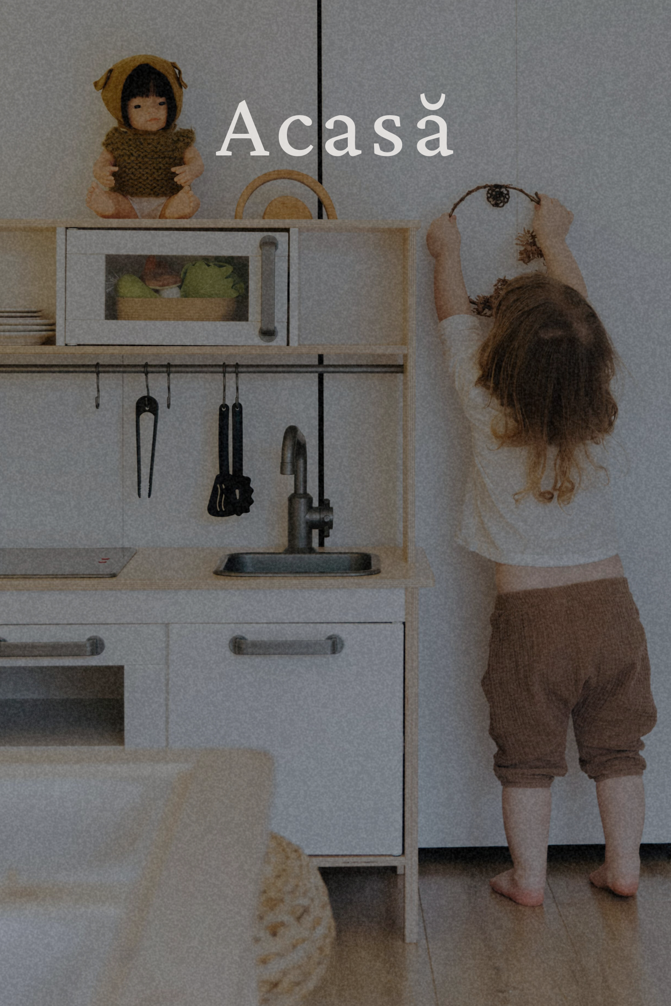
Cultivating Inclusive Strength
Project Brief
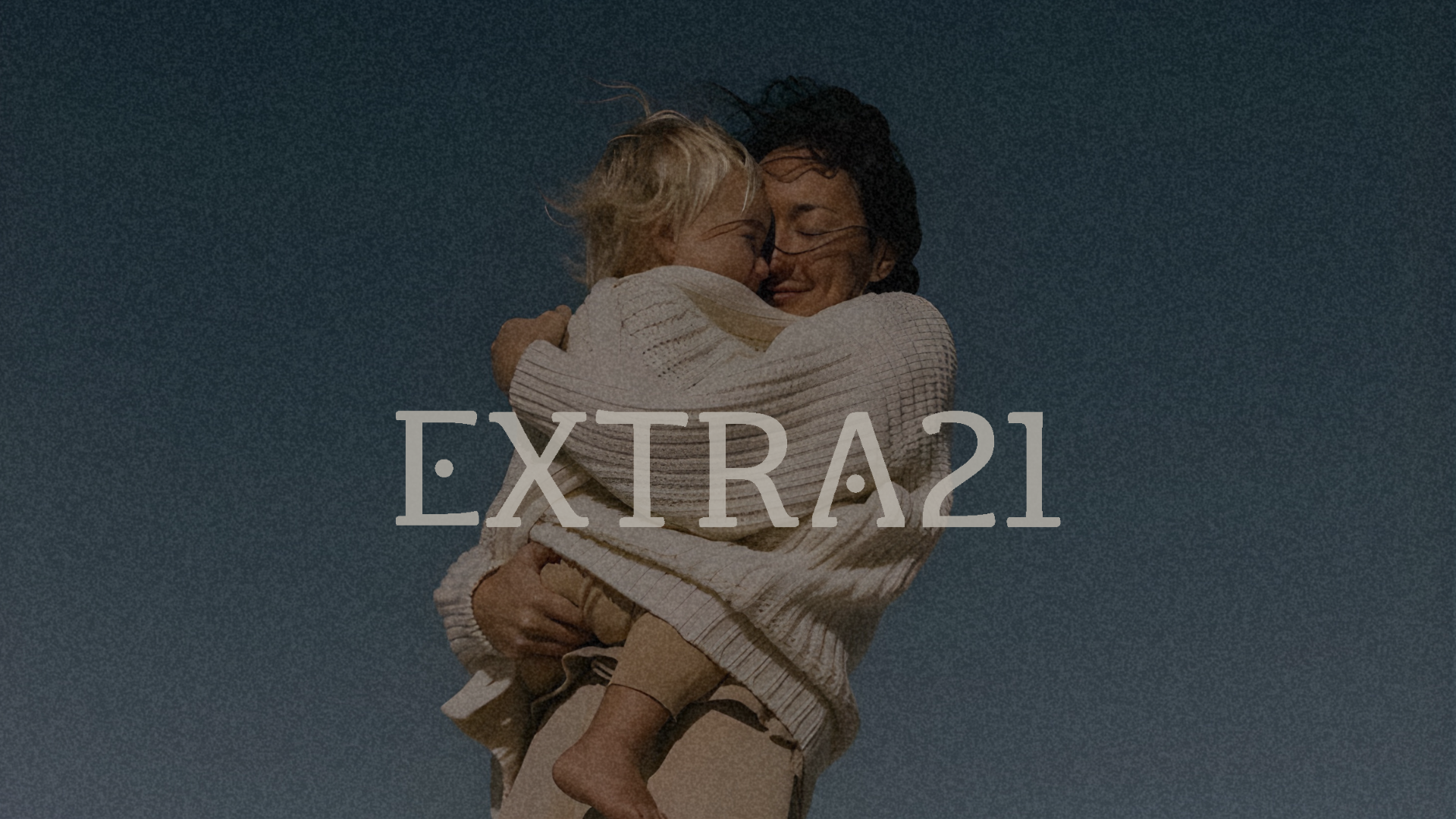
Extra 21 is a Romanian nonprofit championing support and education for families raising children with Down syndrome. Their vision: make every family feel seen, supported, and strong. I was brought in to reimagine their identity, messaging, and visual system around the idea of sanctuary, transformation, and authentic belonging.
Extra 21 is a Romanian nonprofit championing support and education for families raising children with Down syndrome. Their vision: make every family feel seen, supported, and strong. I was brought in to reimagine their identity, messaging, and visual system around the idea of sanctuary, transformation, and authentic belonging.
Brand Strategy
We uncovered their essence: “Where families grow together.” The new positioning brings parental vulnerability and collective empowerment to the foreground, moving beyond charity to true, rooted inclusion.
We uncovered their essence: “Where families grow together.” The new positioning brings parental vulnerability and collective empowerment to the foreground, moving beyond charity to true, rooted inclusion.
Visual Identity
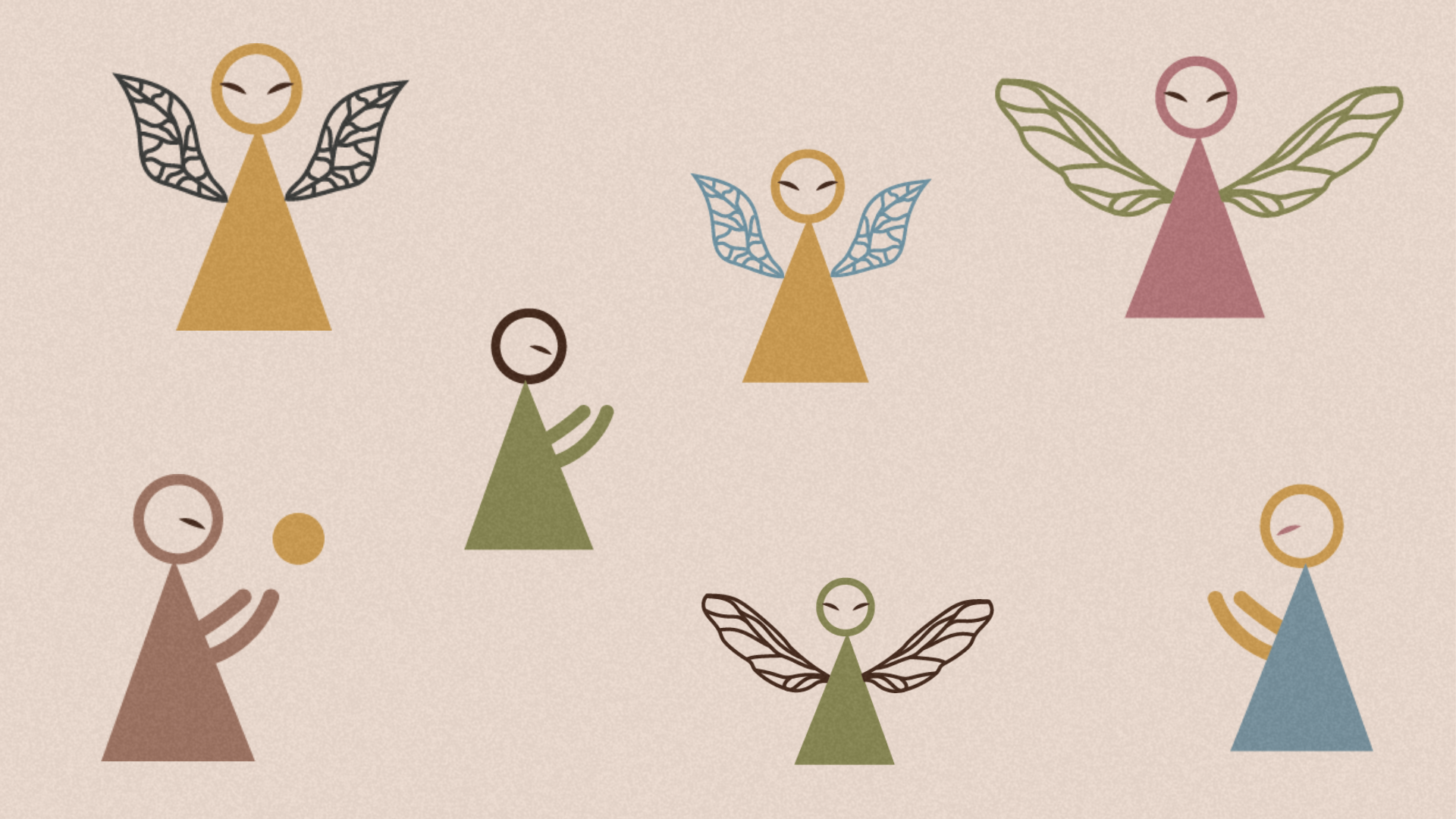
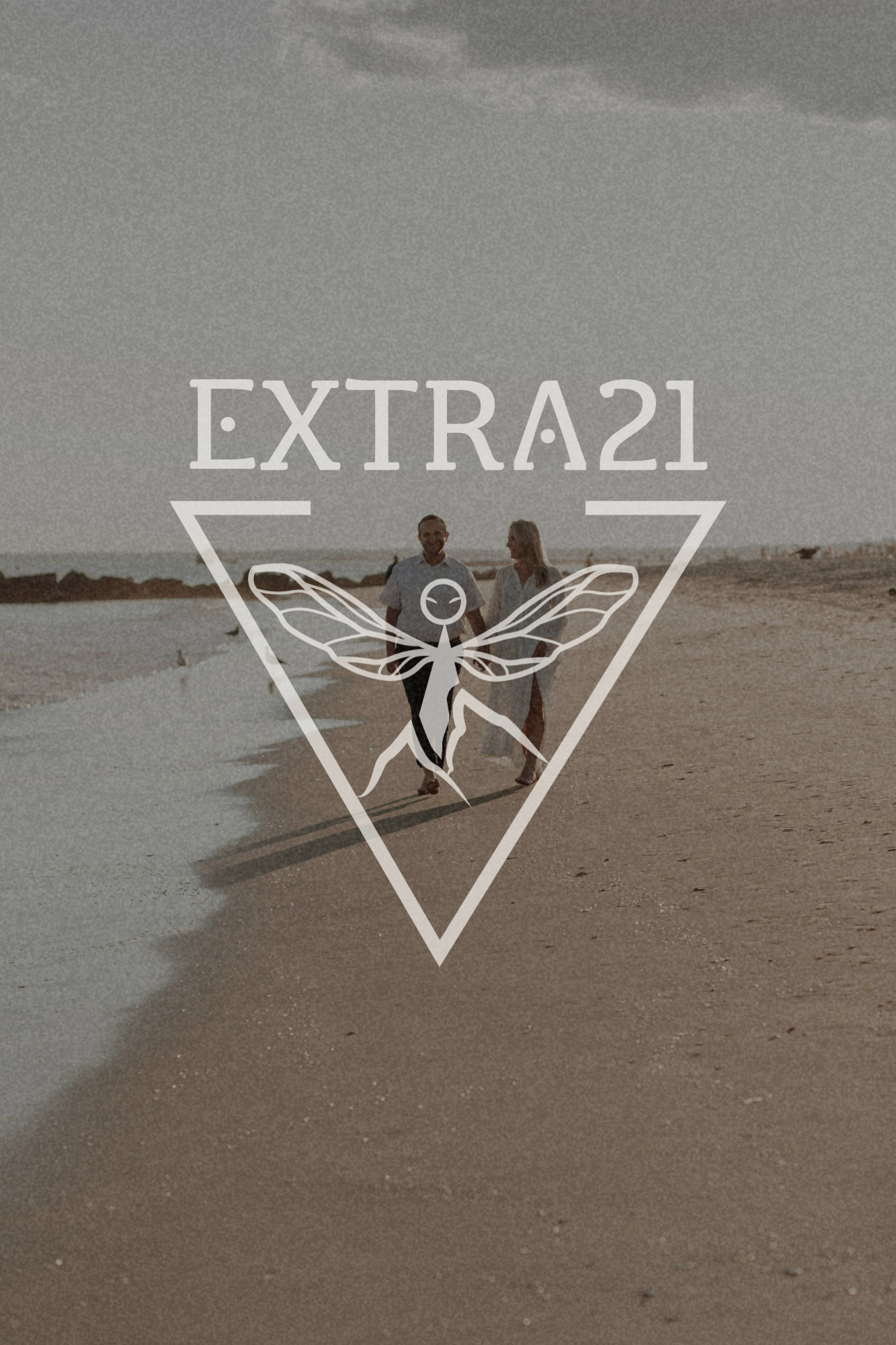
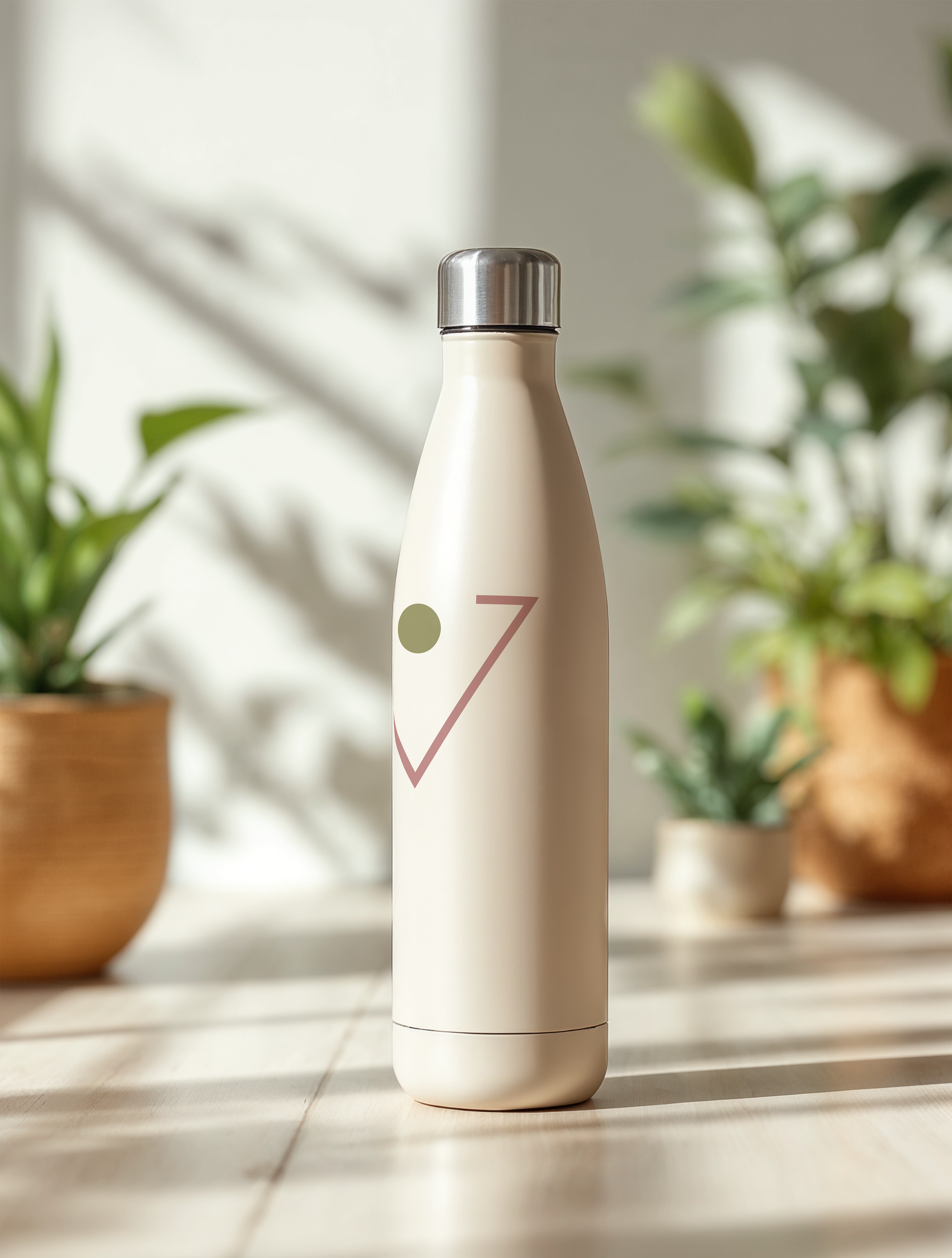
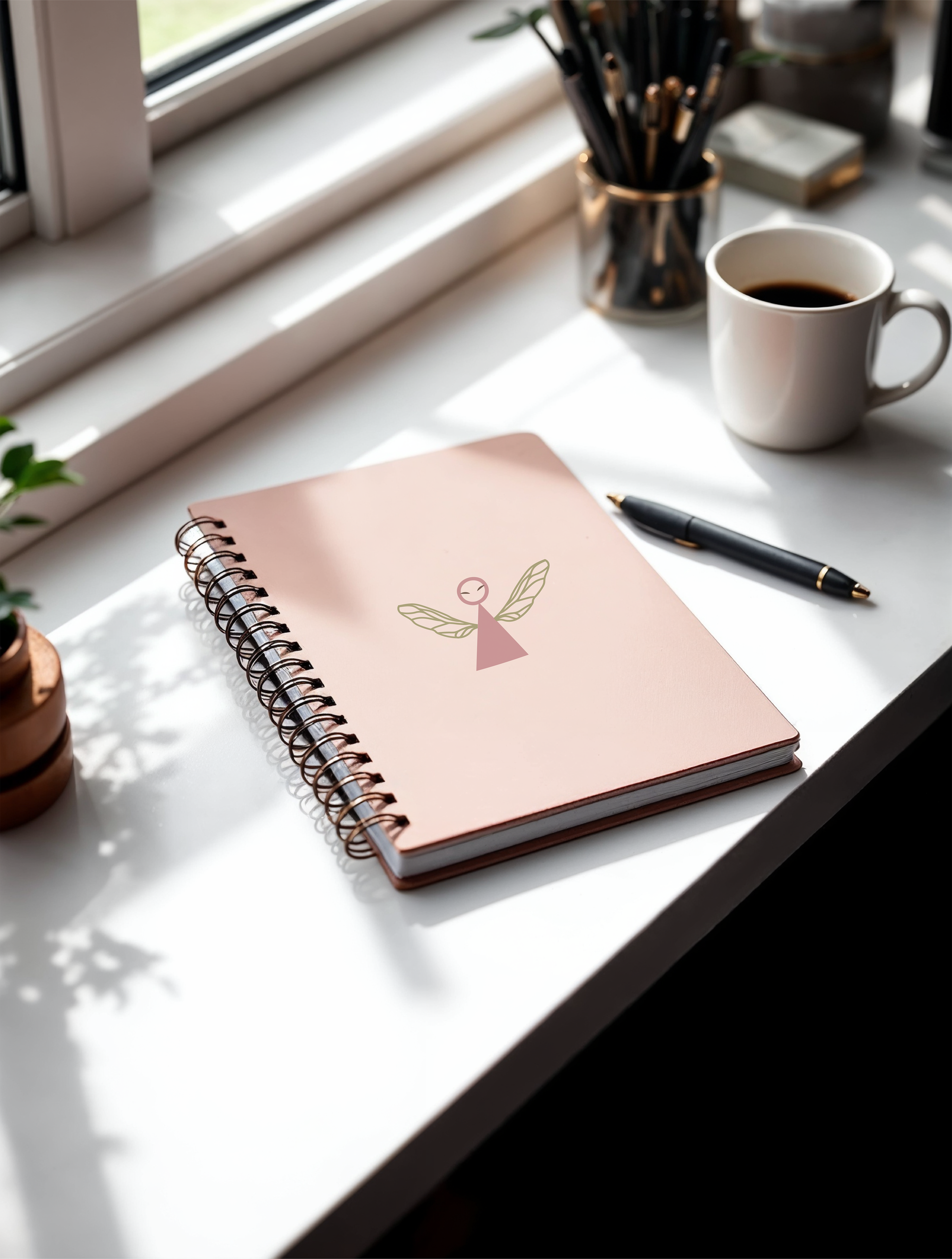
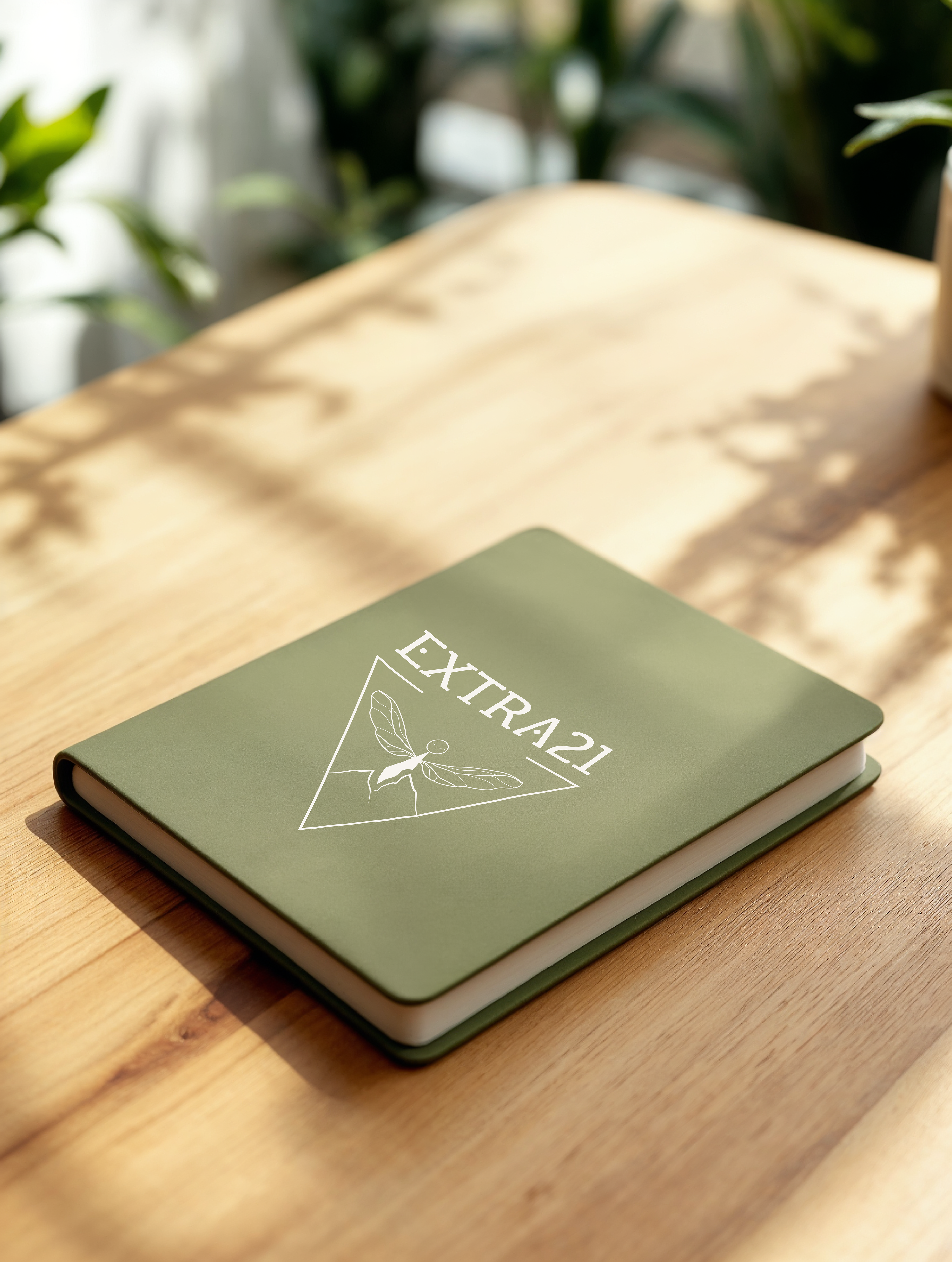
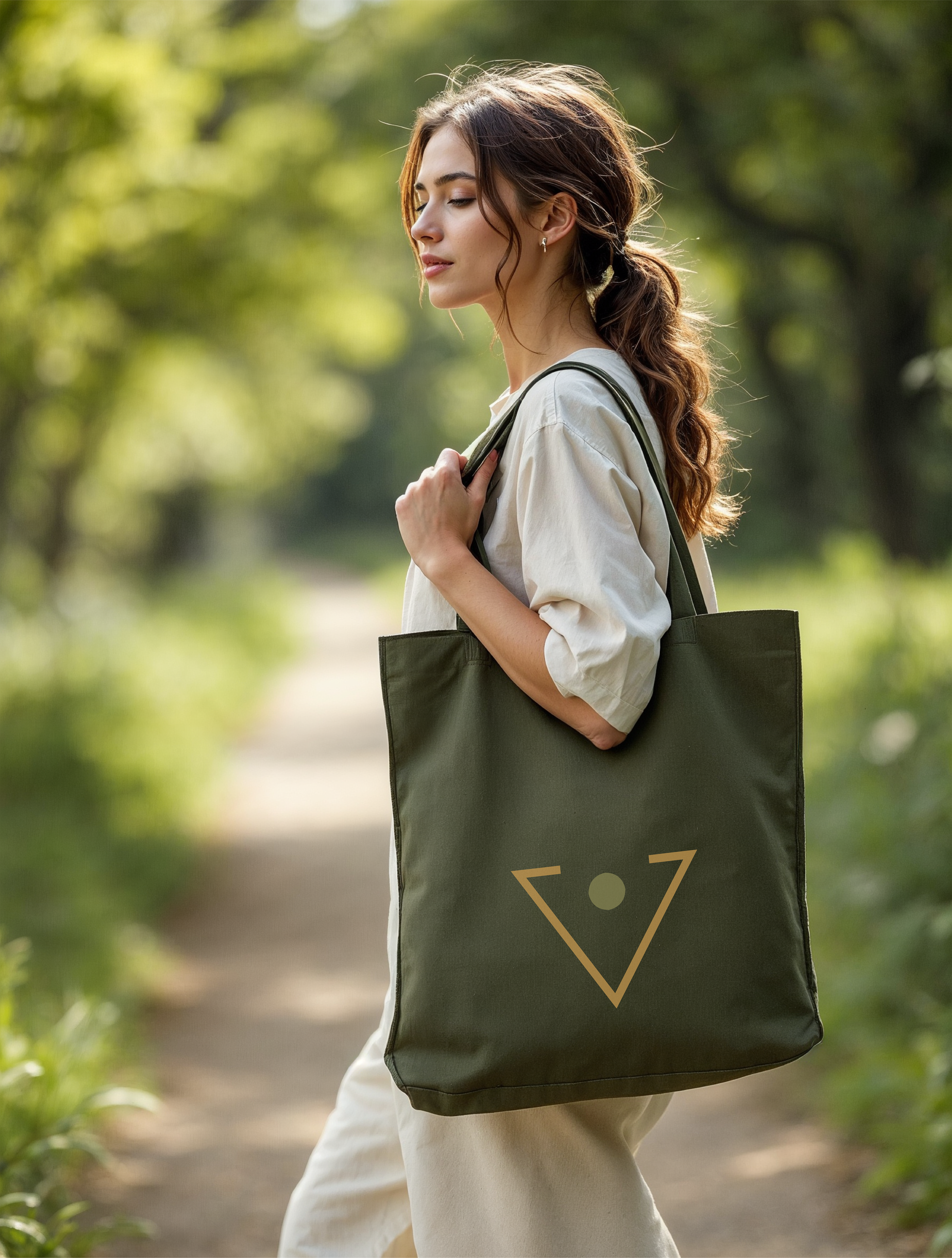
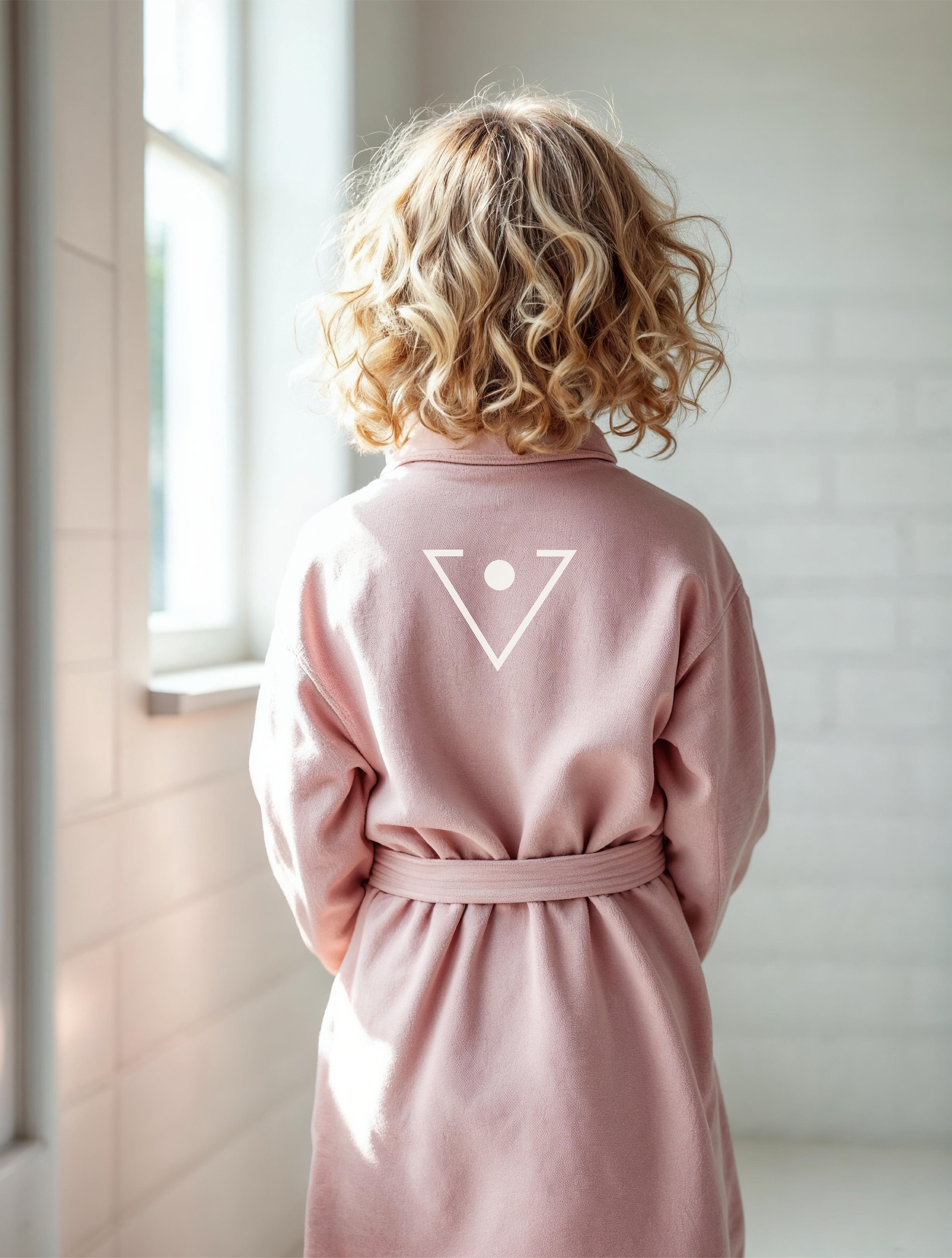
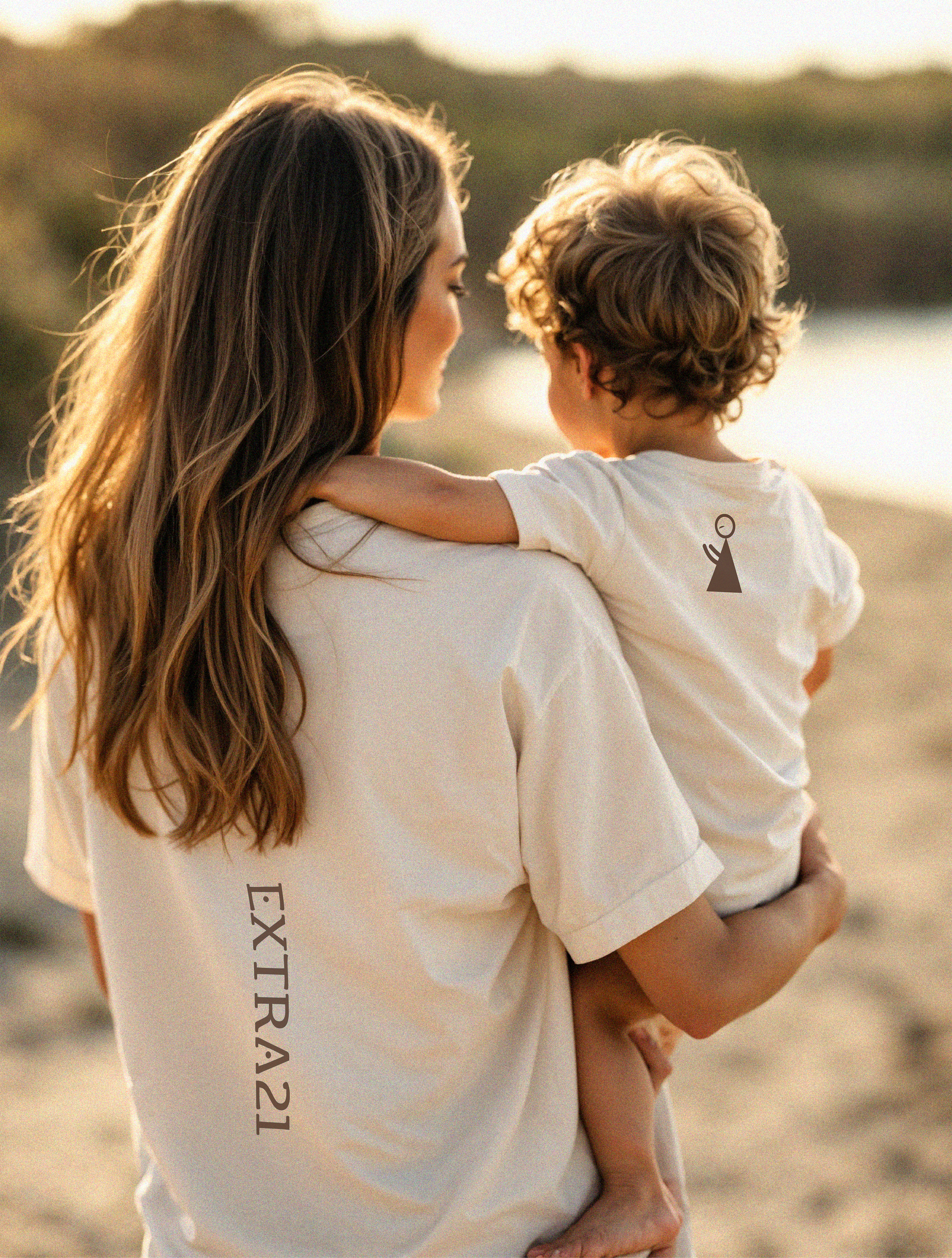
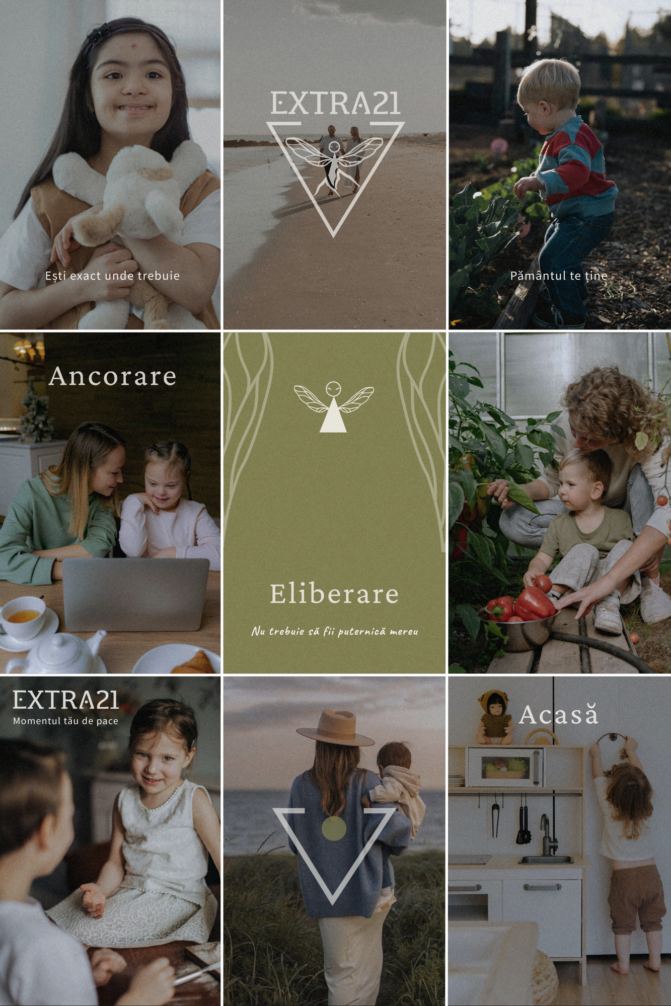
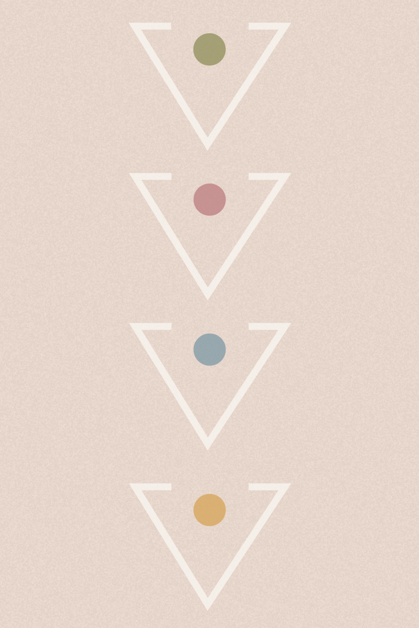
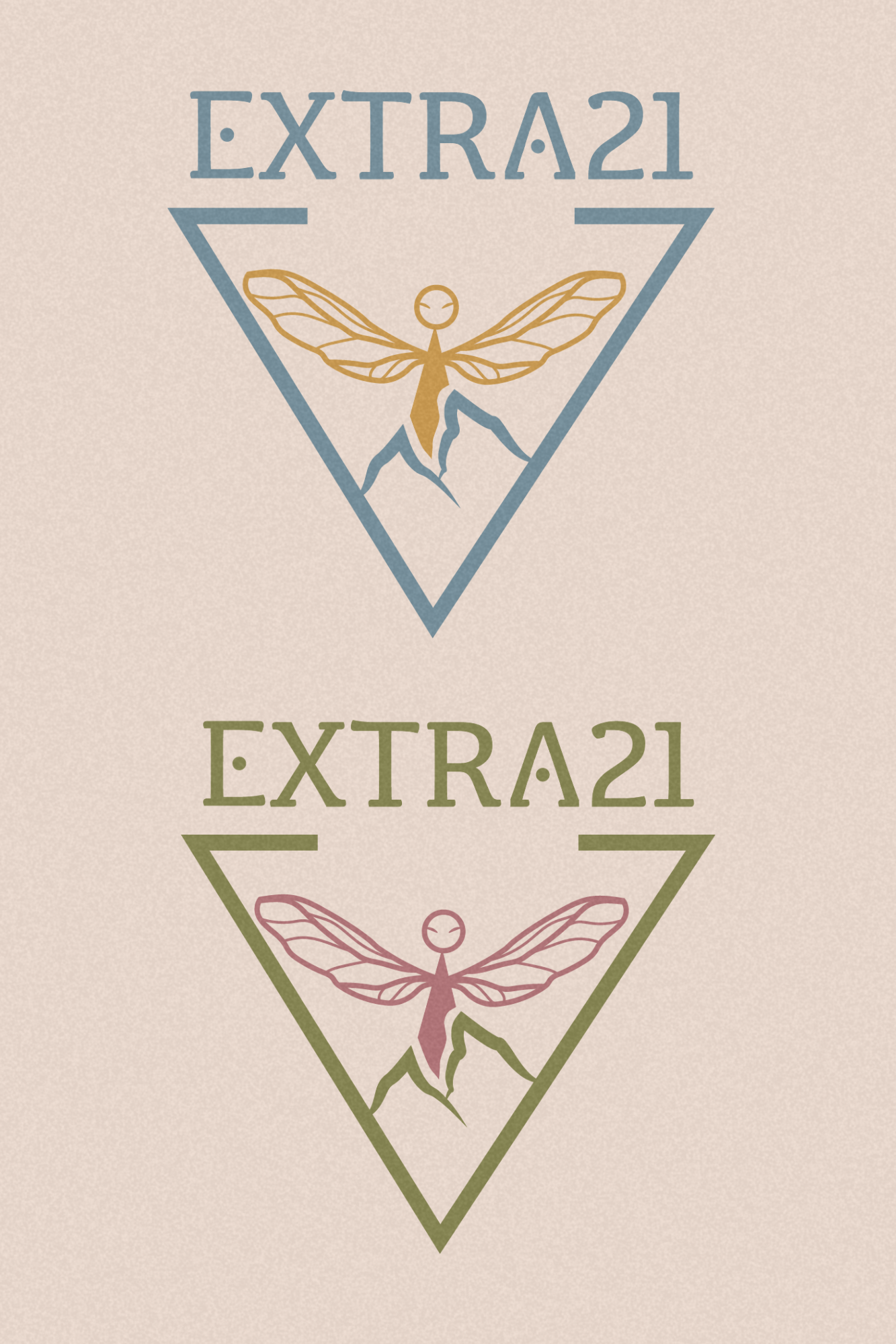
The new logo is built around an open sanctuary symbol, a downward triangle, representing a safe space to rest, heal, and connect without shame. Natural geometry (roots, valleys, and circles) meets modern clarity. Eyes clear, direct, and transformative, anchor the mark, inspired by the truthful gaze of children with Down syndrome. It goes deeper than a mark- it’s a poetic emblem. At its heart is the inverted triangle (“V”), a universal shape in nature and myth that’s open, welcoming, and rooted. It symbolises a protective sanctuary, a safe space for vulnerability and transformation. “You don’t need to be strong to enter. You’re welcome as you are - in this sanctuary, you are safe, protected, and seen.”
Core Messaging
Extra 21 is “the sanctuary where parents find real acceptance and support, so they can grow resilient and connected.” The visual storytelling wraps every touchpoint in warmth and honesty, never overwhelming, always anchoring.
Impact
The rebrand gave Extra 21:
A distinct, ownable identity in the crowded NGO space
Messaging parents can use with pride - in the lift, online, and in the community
Visuals that communicate sanctuary, community, and authentic diversity
A foundation for programs, social media, and advocacy that truly reflects their mission
Rooted in empathy, guided by clear strategy and simple geometry - this is branding in service of human connection, not just visibility.
Rebranding a nonprofit as an authentic sanctuary for families, blending empathy, nature, and clarity to redefine inclusion in Romania.