Designing for Openness in a Closed Space.
The Bilker Bunker project is a landmark urban transformation in Düsseldorf, tasked with converting a fortified WWII air-raid shelter into a vibrant public hub for art and culture. As part of the design team at G31, I was faced with a profound creative challenge: designing for openness in a closed space.
The Vision & Challenge
Our collective goal was to strip away the building’s heavy, monolithic history and create a new visual language that embodied its future as a "place of encounter." We needed to craft an identity that didn't just decorate the bunker, but actively worked to make it feel accessible, navigable, and welcoming to all.
The Blueprint in Action: A Strategic Approach
Our solution was to create a complete visual system that functions as a blueprint for how culture could inhabit this historic space. Every element was designed with purpose, turning the building’s perceived weaknesses into strengths.
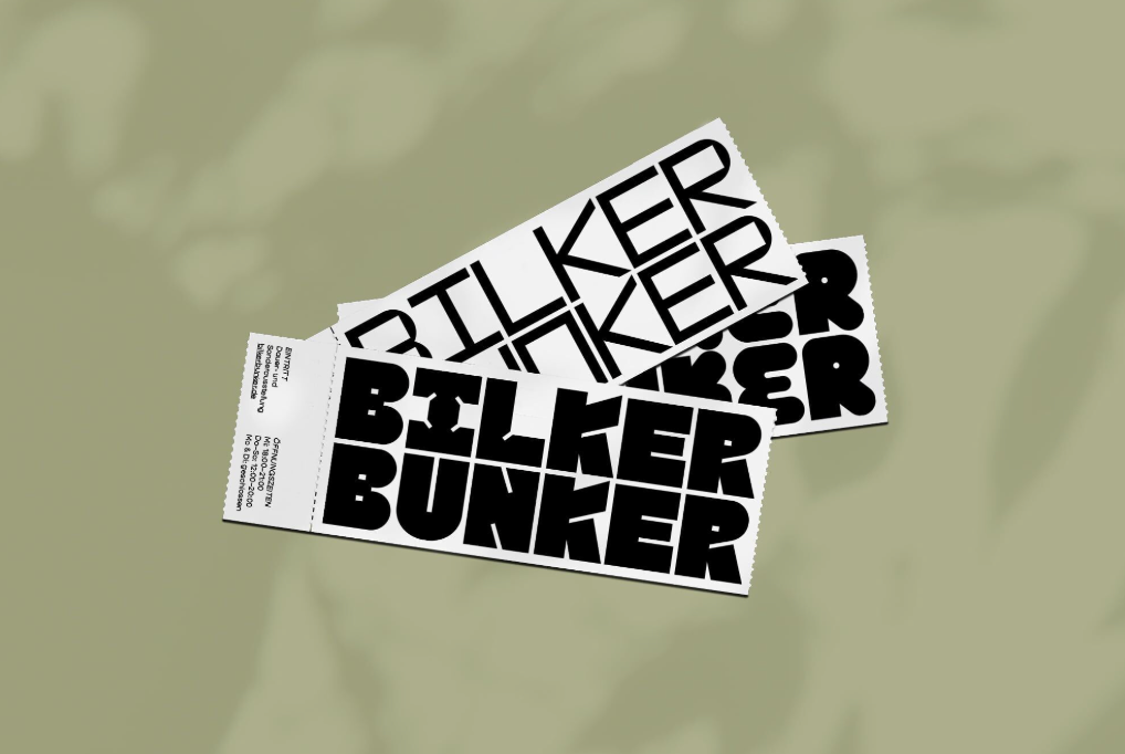
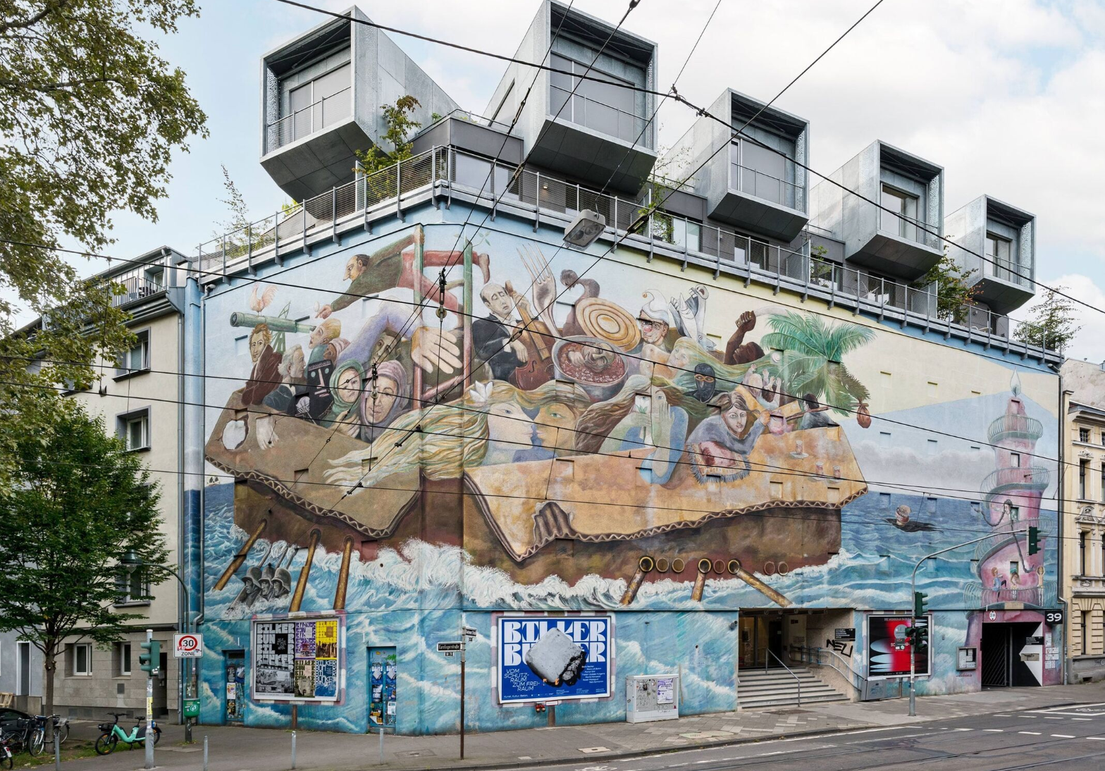
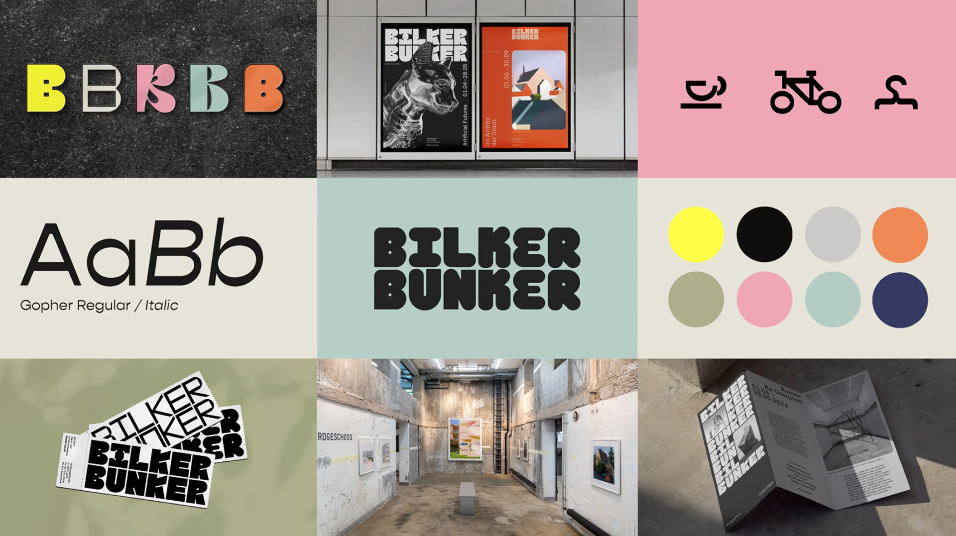
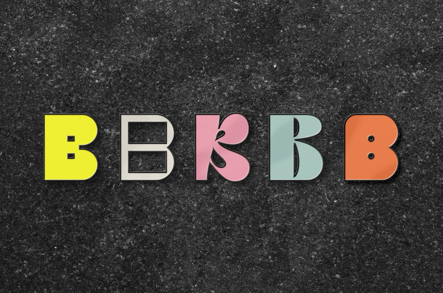
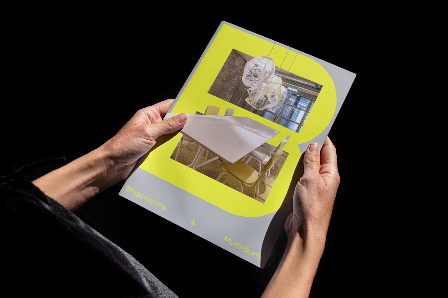
The Logo as a Key: The foundation of our blueprint is the brilliant 'B' logomark. It functions as both an initial for the bunker and, more importantly, a stylised map of its interior pathways and staircases. This simple, clever device visually "unlocks" the building, providing a key to a space that would otherwise feel complex and intimidating.
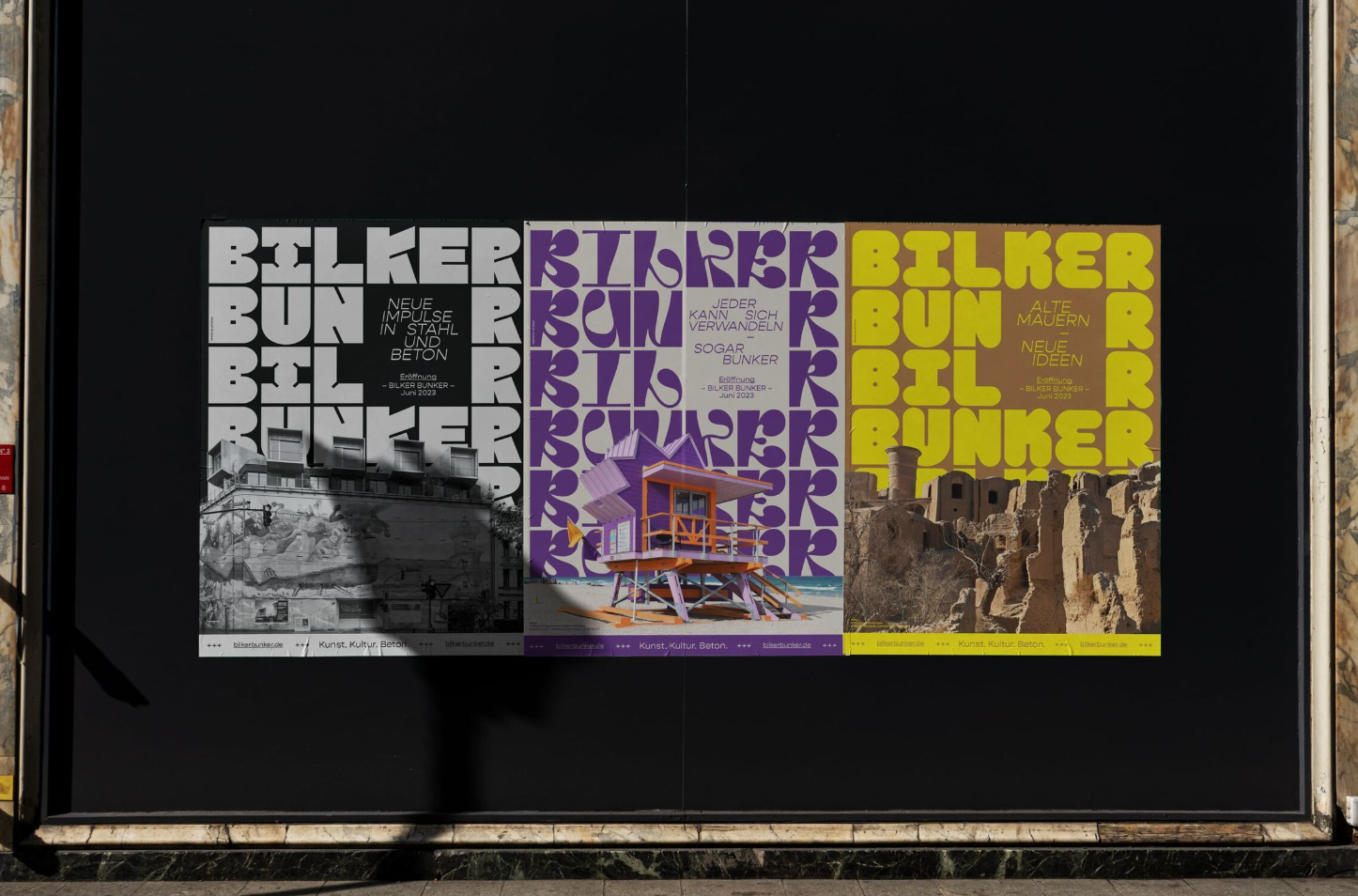
Colour as a Beacon: Our plan required a powerful tool for guidance. The strategic choice of a single accent -Signal Orange - acts as a vibrant beacon against the grey concrete. We transformed a colour typically associated with warning into a warm, energetic invitation. It creates an intuitive visual path that guides visitors through the space with confidence.
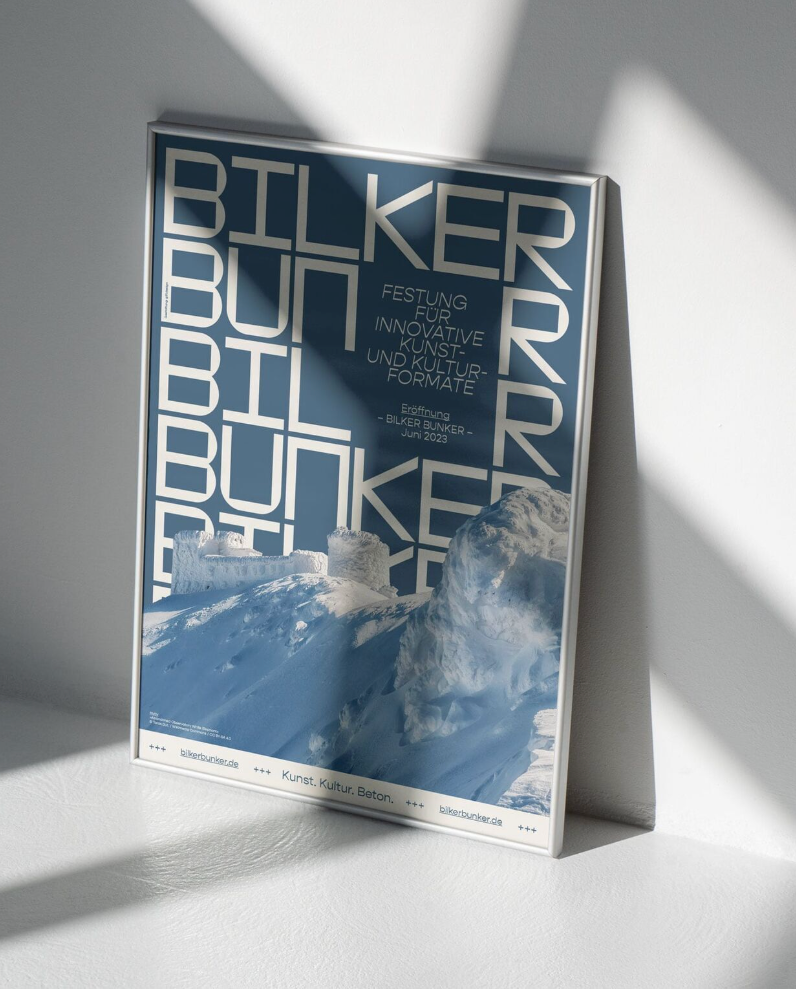
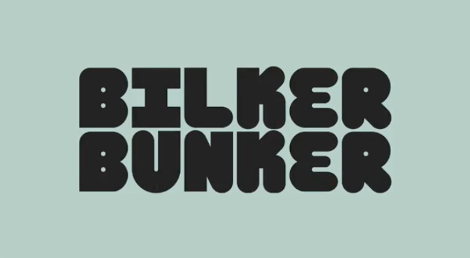
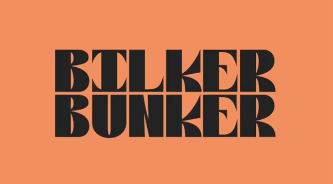
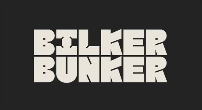
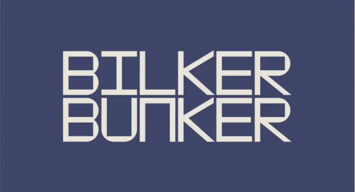
Typography as Architecture: The visual language of the blueprint is spoken through a custom geometric typeface, G31 Bunker. Its clean, structural forms and stencil-like cuts pay homage to the building's industrial past while feeling entirely modern. This typographic choice provides a clear, consistent voice for the institution, from large-scale signage to fine print.
My Role in Executing the Plan
As a key designer on the team, my role was to help translate this strategic blueprint into tangible and effective assets. I was responsible for:
Developing Concepts: Actively participating in the design and development of the crucial wayfinding system (Leitsystem), applying the core principles of the logo and color palette to create intuitive visitor journeys.
Brand Application: Creating detailed mockups and producing final artwork for a wide range of print and digital materials, including on-site banners and posters that brought the new identity to the public eye.
Ensuring Consistency: Collaborating closely with senior designers to maintain the integrity and quality of the brand across all touchpoints during the critical implementation phase.
The Outcome: A Foundation for the Future
The result of our collaborative work is more than an identity; it is a functional and symbolic foundation for the bunker's new life. The design successfully shifts public perception from a historical relic to a dynamic cultural destination.
By creating a system that is both beautiful and practical, we provided the tools necessary to make the space truly public. The identity gives visitors the confidence to explore, ensuring the Bilker Bunker can fulfil its mission as a welcoming and legible space for art, dialogue, and community for years to come.